
So, I’ve been rebuffing all tutorial requests lately by claiming that I’m too busy with Volume 3 to take time out. But in the process of getting our freelancers started, I wrote out this tutorial for them - thereby scientifically PROVING that I am full of shit. And knowledge! So here’s a tutorial on color blocking!
Freelancer Color Blocking:
Directions, Examples, & Tips.
The Ultimate Gentleman's Guide to Coloring Inside the Lines.
Hello! Thanks for helping us with the coloring for this book, you completely rule, [INSERT NAME HERE]! I feel a deep personal gratitude, [INSERT NAME HERE], a connection which is surely unique between myself and you. [INSERT NAME HERE], I hope you enjoy these completely personalized instructions which I have written especially for your eyes only. [INSERT NAME HERE], you are my best friend.
But enough of my totally genuine personal sentiments, here are some fun-filled directions!
1) Exemplary!
Here are some examples of easy, medium, and hard pages. We also show the background coloring versus the detail layer separately, so you can get an idea of what generally goes into each layer.
Page with 'Easy' level of background work.

Page with 'Medium' level of background work.
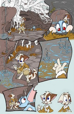
Page with 'Hard' level of background work. (+5 exp. points.)

Example of basic 'background' layer colors.

Example of the 'detail' colors, a separate layer above the background layer.

2) Maintain Proper Altitude.
Be sure to stay in your designated layer for every page. Some pages you may be contracted to do, for example, the background layer only. If you get done early, don't do any 'bonus' work in the detail layer. Even if it's out of the goodness of your heart, we may have someone else already working on that layer of the page simultaneously. To avoid overlap and keep from wasting anyone's efforts, be sure to stick to the correct layer.
Many of the layers included on a page will be locked-the lines layer and the text bubble layer are two examples. These layers are finished and are only there to guide you in the remaining work. If a layer is locked, please leave it on lock, and don’t alter it.
Another layer related note - if your version of Photoshop has the ability to use nested layers, please don't utilize it, because we're running Photoshop version 7.0 and such things are foreign and terrifying to this antiquated relic.
3) PIXEL CREEPS!
This is an important one. Before you start blocking in colors, you need to get the right settings for the paintbrush & paint fill tools. They are often on a default setting that, for color blocking, sucks. The whole point is to meticulously color the shape underneath the pencil lines - but if used with wrong settings, paint fills and brushwork can gradually expand or 'creep' the original shape beyond what you colored.
Make sure the paint-fill tool has the 'anti-aliased' box UNCHECKED.
Yes---->

NO----> 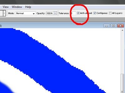
Open a random photograph file in Photoshop and experiment to see what I mean. Leave that venomous little box checked in, and click-fill some pink somewhere. Boom, a chunky area of pink occurs, just as planned. But, keeping the mouse in the same place, click the fill tool again. And again. And again. You'll see the area of pink gradually creeping larger and larger and larger before your eyes. EEEK. You can see how this tool setting would be a threat your meticulously shaped color blocking. Leave it unchecked and preserve the precision of your painted areas.
Likewise to protect your color block shaping, you have to fix the brush tool. In fact, it won't even really be the 'brush' tool anymore. Right clicking on the tool, change it from the 'brush' setting to the 'pencil' setting.

The brush tool, even when dialed down to the absolute minimum 'softness' or 'feathering,' still creates the tiniest bit of feathering on the edges. We don't want that, we want the edges to be totally hard pixels with no softness at all. It makes it way easier to select and mask different layers & effects when we get to the shading stage. Feathering is the enemy in color blocking, so be sure to stick with the 'pencil' setting!
Be sure to switch the ‘eraser’ tool on the pencil setting too.
4) Coloring in - and under - the lines.
Technically, you don't want to color *only* inside the lines. In the shading stage, the lines will be lightened up a whole lot - sometimes they almost disappear. So the colors that you block underneath will really be doing some heavy lifting in defining the final shape. You want to color inside and also underneath the lines - just as long as the color doesn't spill totally outside the lines.
Small tip - if you turn down the opacity on the lines layer, you can see through to how your color blocking is fitting the shapes easier.
5) When in doubt, go neon.
Sometimes there will be squiggly pencilly blobby things that absolutely defy definition. What in the hell was David thinking when he drew it? Scientists are performing tests, but we're still not quite certain. If you come across strange shapes or tidbits like this and have no idea what color to use, just use like a screamin' neon green or pink. We’ll have a layer titled ‘Questions,‘ and paint your neon stuff onto that layer.
Using a crazy neon color still gets the work of defining the shape finished, and is a good shorthand technique to tell us 'Hey, not sure what this is, but at least it's colored in.'
If the shapes are colored with hard pixels and no feathering, we can easily play with the final color choices over here before shading.
6) So cool, they're HOT!
Some hot-keys that I've found incredibly time-saving with color blocking are:
The tab keys [ and ]
Check 'em out! they automatically change the brush size of your pencil tool, so you don't have to slog up and use the slider bar every time. The tab keys kick ass - if you have a tablet of some type, you can probably customize its interface to correlate to those hotkeys. And just FYI if you're ever shading, holding down 'shift' while using the tabs will adjust the feathering on the brush tool. Spiffy keen.
Also, the 'x' button automatically switches between your active colors, and holding down the spacebar will let you click and drag to navigate through the image. There are tons of other hotkeys too, so if you find yourself getting slowed down by a repeated manual action, hit google and see if there's a hotkey that could make your life easier.
5 comments:
:O MOAR!
thanks David for taking the time to do a short but concise and informative tutorial.
thank you thank you thank you thank you! every word spewed from this man's mouth gives enlightenment and fulfillment. plus it was personalized just for me! yay!
Absolutely amazing! Imma do my next webcomic page in colour and see how everyone likes it!
Thanx for the tutorial info. Glad to hear there's a separate layer for word bubbles -- some of my favorite webcomics creators tend to be creative at spelling too; spellcheck only gets some of it... maybe I can volunteer some editing time?
Your convention-dates list is still for 2010.
After reading 6-part post on blog I searched the (Billings MT) comic store, Yellowbook first, then Web; the name of the store? The Splash Page. Result? MTV!
Whoa Dave. Unleashing your trade-secrets on the world, I see. Soon you'll competition from the North Koreans: cheaply colored Dreamkeepers comics sold on bootlegged sites.
Post a Comment